Chaser is committed to ensuring that every user has a great experience using our product. We are dedicated to continually finding ways to improve the experience for our users. Today I’m excited to announce a few enhancements this team has made to improve usability and efficiency across the application.
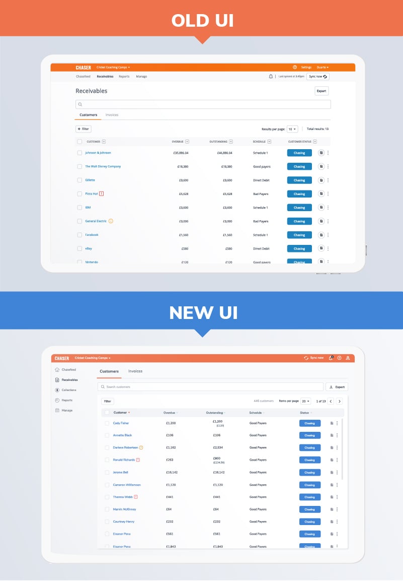
First, we’ve updated the look and feel with a new font, colours and layout styles that reflect the new brand released in December 2020. They are not only pleasing to the eye, but are designed to help our users focus on what is most important while using the application.
For example, highlighting the main content against the background immediately sets the hierarchy and where to look.
Secondly, we changed the navigation from being entirely horizontal to a split between top level and left aligned sections, to further enhance the content area and give our users more space where it matters, for both small and larger screens. In addition to that, the distinction between the chasing sections and less frequent ones like the Settings is more clearly defined by this split. To reinforce this point even more, we added some iconography to give the main sections extra weight and character.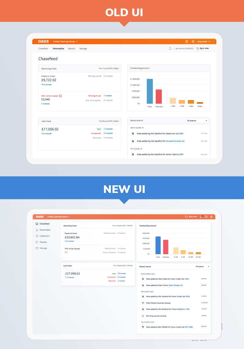
Additionally, we made some improvements “under-the-hood” to really bring home the theme of usable efficiency. For example, the new navigation will remain visible and accessible even when scrolling down for longer pages. This not only helps maintain the context, but also makes it quicker to navigate away and change it. In the same line of thinking, the Receivables table has been revamped to keep the user aware of what they are seeing at all times, being able to edit filters & change pages independently of where they are in the table.
Finally, the team looked at accessibility with increased font sizes and contrasts for better legibility which solidify this update in a complete user experience.
However, complete doesn’t mean finished of course. Continuous learning and improvement is in our DNA, and that is the only way we can guarantee the best for our users. If you have feedback on these enhancements, please submit them at product@chaserhq.com or complete this short survey.
All of these enhancements are available today to all Chaser users. New Chaser users will land in the new user interface by default upon logging in.